shelter space
This site shows my humanitarian and social design portfolio. I do process design, so optimisation of social and humanitarian processes, through system design and product design. I strive for Efficiency of humanitarian actors, through a needs based approach. I research, teach and talk about that.
humanitarian, process design, product design, social design, Frankfurt, international, German design, humanitarian Innovation, Germany, Human Centered design, community centered design, Thomas Jäger, design portfolio,
510
page-template-default,page,page-id-510,bridge-core-2.2.9,ajax_updown,page_not_loaded,qode-page-loading-effect-enabled,,qode-title-hidden,qode_popup_menu_text_scaledown,qode-theme-ver-21.6,qode-theme-bridge,disabled_footer_top,disabled_footer_bottom,qode_header_in_grid,elementor-default,elementor-kit-8,elementor-page elementor-page-510

SHELT
ER SPACE

THE SHELTER SPACe
APP

2019

Empathic monitoring and communication of the space available for each citizen in a refugee camp, with little efforts and cost-efficient

In 2018 the “New York Times” stated that the “Moria” refugee camp was the most densely populated spot on earth. The residents had less than one square meter of personal space. The responsible authorities were aware of these inhumane conditions, which violated international standards for refugee camps. The quality of life and safety of the residents was particularly poor due to these conditions. The pandemic worsened the situation dramatically, as compliance with social distancing rules was impossible.

Other formally set up camps in Greece and globally show a similar picture. Even though formally planned the resident counts shift constantly and often to a degree that camps are not capable of inhabiting everyone in a way that provides dignity. This leads to inhumanely little space per person inside a pandemic, but also outside and contradicts even humanitarian shelter cluster standards. 

sum
mary

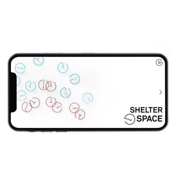
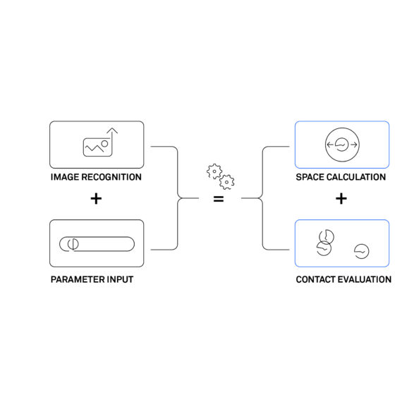
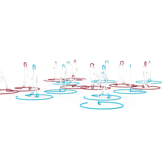
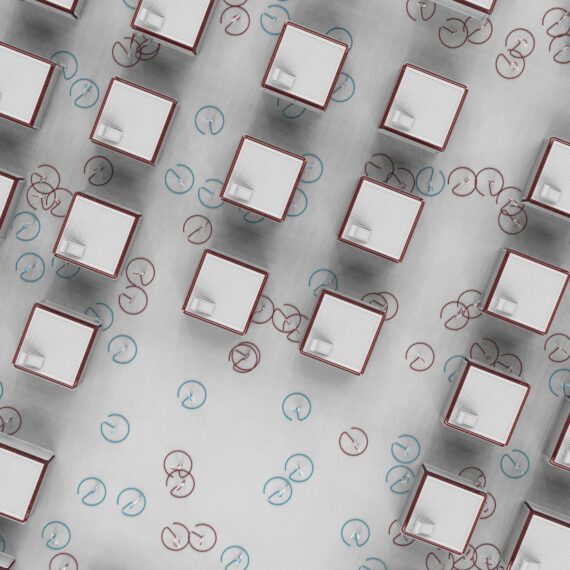
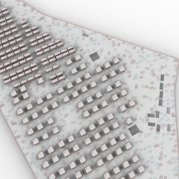
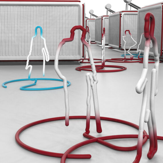
Shelter Space is a solution to the problem of dehumanizing little personal and public space in refugee camps. Using data collection and visualization, people can calculate the ratio between the area of the camp and the personal area per resident without special expertise. Standards such as minimum distance (pandemic), but also personally required private zones can be determined. The potential for contact between people in outdoor and indoor areas can also be calculated. A contextually understandable visualization of everyday life in the camp forms the basis of the project. Other than expressing the person:area ratio in numbers, it becomes directly clear by means of the visualization what these numbers mean.

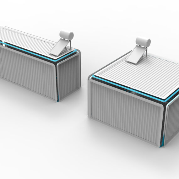
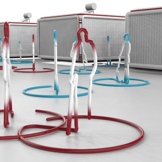
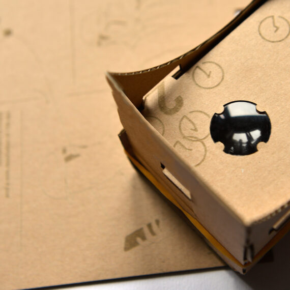
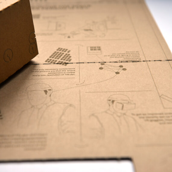
It is communicated to the viewer that these are individuals. In order to make the collected data understandable and accessible to all groups of people, one can experience parts of the emergency shelter in VR (Virtual Reality). The representation includes the living containers. The indicator colors red and blue indicate whether contact is taking place. Here, red is classified as an alarming color and blue as a neutral color. Organizations can order a VR cardboard with a personalized download code for the software. Once the app is installed on a cell phone, an aerial view of the emergency shelter can be fed in and constantly parametrically adapted.

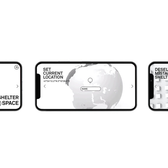
A simple, linear UX (user experience) operation.  With this UX it allows depended on the context the citizens, public, or organisations use it.

Previously, this was done by professionals at great cost and effort.

Starting with an
AREAL PHOTOGRAPHY taking by a satelite or drone

Currently, a trend to use aerial pictures taken by satellites or drones to collect data and identify parameters on the livelihood of a neighbourhood or refugee camp gets focused in the humanitarian world. It is a quick way to establish a basic set of data that then can be used to evaluate different aspects. It is intriguing due to its ability to actually capture the current state of the settlement, instead of working on outdated plans of construction.  Shelter spaces use that methodology and integrate the collected set of basic data into a parameter adjustment interface, which finally leads to evaluable visualizations.

From an areal photograph to
a simple digital solution, to measure and evaluate conditions

The phone as an already existing and available interface

This interface is located on the personal mobile phone.

A cost-efficient App-solution provides the parameter inputs the evaluable 3D-visualization, the VR-view, and cloud access to exchange and saves the data collected, for further monitoring and evaluation.

Modifiying a few parameters on the phone
in a simple UX

The UX is an adaptation of the UX of common slide galleries. Users swipe through the different screens back and forth.

The order based on the causality of the parameter input allows them to be sure at which stage of the process they are. Each screen only shows the most important elements for interaction, keeping the experience low in its complexity.

Beginning with a login and location set up, oversize adjustments e.g. citizen count input, they continuously get closer to the visualization they want. The entire process as soon as an air picture is taken is done within a few minutes.

prametric, iconic Shelters,
to make the visualisation
understandableshelters

Communication is the key to the shelter space concept. The data is not described numerically rather contextually to make it more understandable. It makes the shelters of camps identifiable. 

Even though these spaces can parametrically be changed but the most iconic parts of container liker shelters are extracted and used for the design concept.


It's not about numbers.
It is about real people

Even more important creating a contextually clear visualization than using the actual containers, is to highlight that the data collected is not about numbers. It is about people! Too often the citizens of these camps are seen as numbers within a system, especially by officials who are not having the needed inside perspective, on what it really means if someone just has 2m personal space of an entire camp.

Shelter space doesn’t give people numbers. It shows the people represented by different avatars with names and shows their daily life activities.

Visulizing the personal space and the colission of those, when people move around

The Avatars are designed in a distinguished way which gives a clear vision to people.

The top-view focuses on walking directions which leads to a  different geometry connecting the avatar to the surrounded circles. These adjustable circles show avatars’ personal space and can be parametrically scaled. These indicate a collision with another avatars’ personal space by changing the neutral blue colour to activating red. Each avatar is placed in 100 randomly picked positions based on main traffic routes.

While doing so, the software evaluates contacts and overall contact possibility which equals an agile numerical indicator.

Space indicators in the
outside area

The users can evaluate the space resident ratio in inside and outside spaces, to get a holistic insight into how much space is available for each person. A settlement that allows keeping distance on the outside, but not in the inside areas, still needs to be improved. While looking at the parameters of the outside space the visualization shows the avatars with the indicators distributed there. The shelters are closed, but give a first insight about the space resident ratio inside, through indicating colors on their edges. 

Space indicators
in the inside of
the containers

As soon as users want to evaluate the inside space resident ratio, they set up the needed parameters. Firstly the app distributes all residents equally to the shelters, which already creates an average analysis. In case users want to be more certain about the detailed living conditions, they can adjust each container’s resident count manually. 

After inputting the ratio between private dorms and communal inside areas, the avatars get distributed on the space of concern and their contact probability evaluated.

An understandable and
empathy forging overall
visualization

When all of these components come together, they finally result in an overall visualization of the camp, being able to shift from an inside space visualization to an outside space visualization.

This shows the entire camp with all residents, all shelters, and their personal space person ratio indicators.

Furthermore, it also gives an overall color indicator on the outside edge of the settlement, allowing quick evaluation.

VISuA
LIsAT
ION

The technical set up

The software is prototypically designed using Grasshopper as a low coding tool.

It is fully parameterized and therefore fully adjustable.

The graphic above shows the technical function in an overview and mirrors it to what is visual to the users. It also shows that the process is a circular one that can be reparametrized at any point internally or externally, if shareable.

The graphic on the right shows its simplification: Image recognition + user input equals with the calculations of the software a contact, and personal space evaluation.

Empathy through personal VR-experiences

Making the data contextually understandable through visualizing the shelters and highlighting the different people through avatars is just the first step to create a real understanding and therefore empathy. Using a cheap cardboard-VR solution lets the users dive into the visualization themselves and get an inside perspective of how narrow people really are. They can look around the inside of a shelter or check out the main point of interest in the outside space.

The implmentation
through a carboard-VR

The app can be downloaded freely depending on the context and role of the user. In contexts where there is a need to monitor who is collecting data and for what, to verify their accuracy and keep data secured, the cardboard-VR can be used as legitimization to download the app. Organisations can order the personalised flatpack cardboard box. Before opening the box they can scan a QR-code that downloads their app with pre-personalised access and ID. After opening the box, they can follow the instructions on the inside explaining the overall usage and assemble their cardboard-VR.